Score some NACT-only merchandise
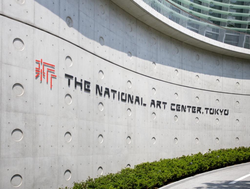
The National Art Center, Tokyo’s logo is a stylized version of the Japanese character 新 (shin), meaning “new” and symbolizing the institution’s innovative and creative essence.
The logo was designed by Kashiwa Sato, a prolific creative director noted for his work on the visual identities of globally recognized brands such as Uniqlo. Sato’s creation employs the two traditional Japanese colors—scarlet (hi-iro) and cinder (keshizumi-iro)—used by NACT architect Kisho Kurokawa in his design for the building.
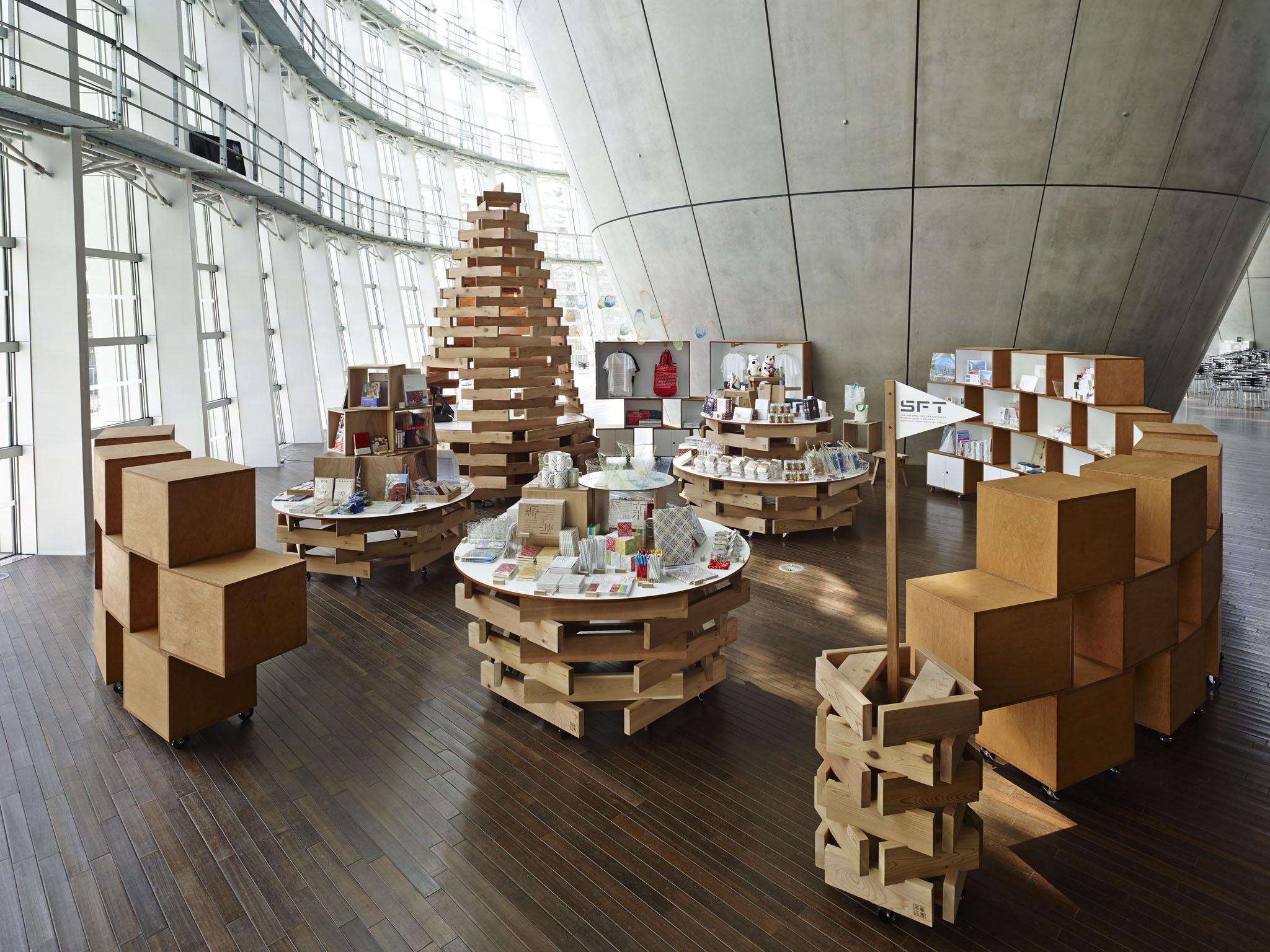
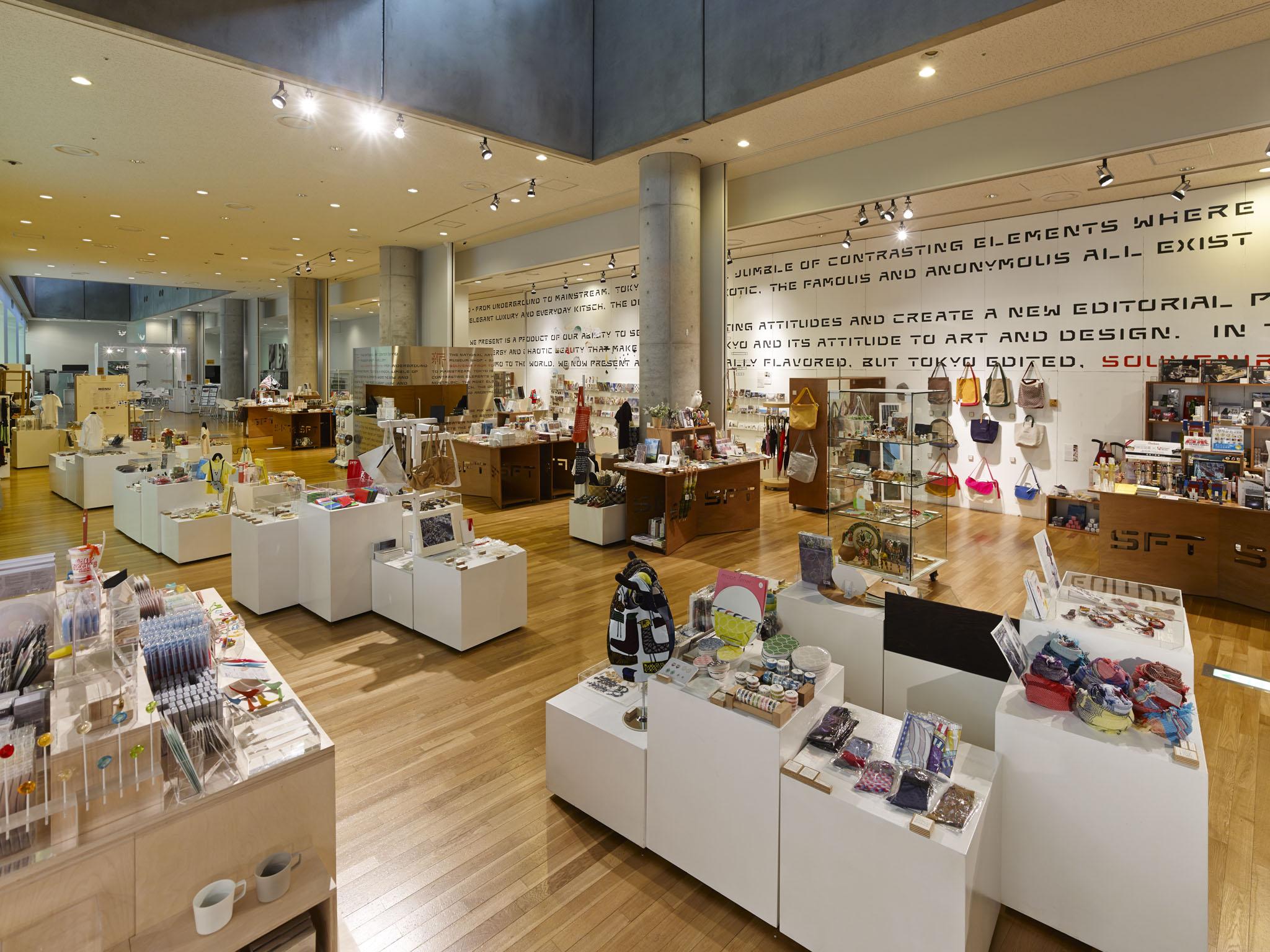
The combination of straight lines and curved surfaces in Kurokawa’s architecture is also reflected in the logo, which decorates a variety of merchandise available at Souvenir From Tokyo, the museum shop with locations on the first and first basement floors. These items range from coffee mugs and cloth bags to sketchbooks and make for stylish gifts. Souvenir From Tokyo also carries a diverse selection of Japanese-style accessories, clothes, crockery, and items by local designers.
The full story behind the logo and its message can be read on the Logomark and Logotypes.
 |
 |
 |
|

